Plain-English Health Feed
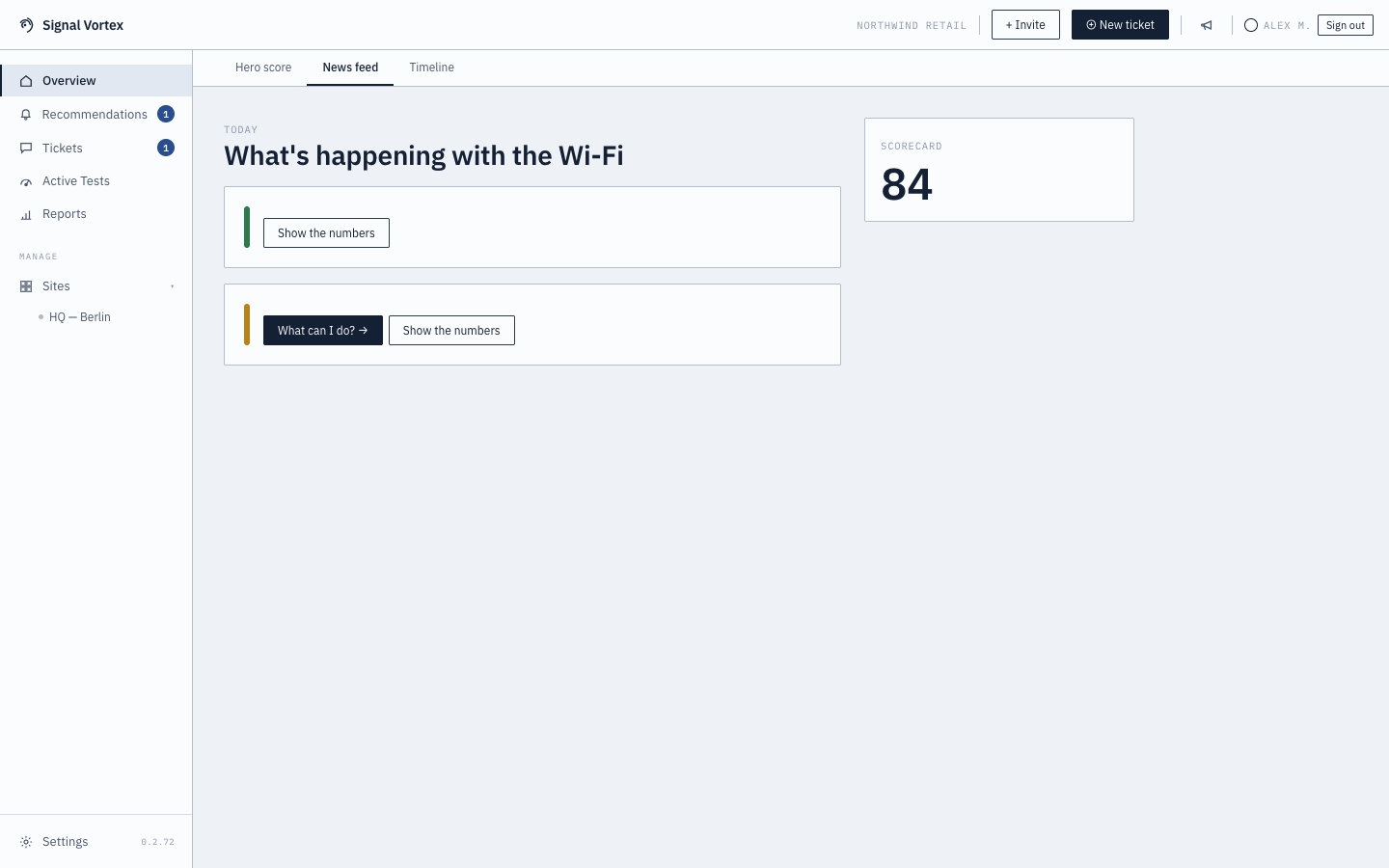
Next to the score ring, the Overview screen's "Plain" tab reads more like a news feed than a dashboard: a list of short, human-readable stories describing what's currently going on with your Wi-Fi.
What you'll see
- Each story is tagged good, warn, or bad, and describes one situation in plain language (no jargon, no acronyms) — e.g. a site that's struggling, or confirmation that everything's fine.
- Two possible calls to action on any story:
- "What can I do?" — jumps to the Recommendations Inbox for concrete next steps.
- "Show the numbers" — jumps to the underlying technical view (Dashboard) if you want to verify it yourself.
- A side panel with a scorecard number, a short history sparkline, and quick stats.
Why it matters
This is the version of the health score meant for someone who doesn't want to (or need to) think about RSSI or airtime utilization — just "is it fine, and if not, what do I do."