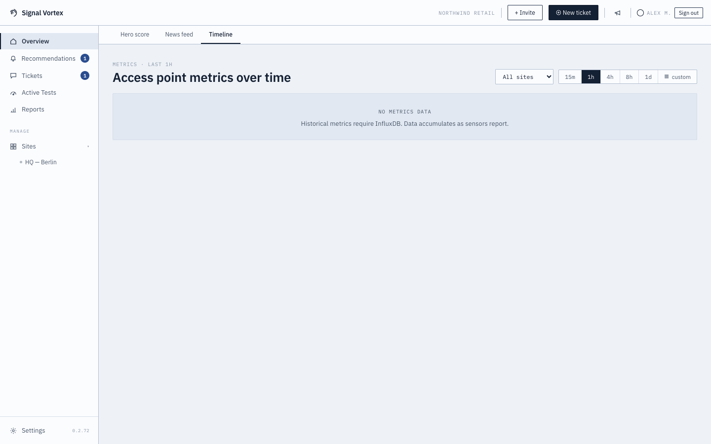
Health Timeline
The Timeline tab is the drill-down view: instead of a single current number, it shows how things changed over time.
What you can do
- Pick a time range — 15 minutes, 1 hour, 4 hours, 8 hours, 1 day, or a custom range.
- Pick a site, if you manage more than one.
- Read charts for:
- Health score over time — spot exactly when things changed.
- Per-access-point RSSI — signal strength trends for each AP.
- Per-channel / per-BSSID airtime utilization — how busy each radio channel is, with a dashed reference line showing the same metric one day earlier so you can spot what's unusual for this time of day.
Why it matters
If something felt slow "around lunchtime yesterday," this is where you go to actually see it — and to check whether it's a recurring pattern or a one-off.